

React Native Card –
In this article we are going to discuss about “How to Design Card in React Native“, here we design the card using pure CSS, and without using any third party library.
When we have to show a ListView with list of cards and each card contain the some information, so let’s start.
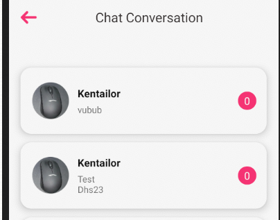
Example Output –
Follow all the steps for designing card –
Step 1 – Creating app
For using this functionality we need to first create a react native app or may be you have and existing one, then use this with your existing app.
react-native init FABDesign

cd FABDesign
Step 2 – Run the app
Goto the path of your app and then run the app.
react-native run-androidStep 3 – Design View
- For designing custom card you need to put the following code within your render method.
- In render method we only call the FlatList where we put the header, footer and main component.
- chatListItemView – is a main design view
render()
 return(
   <View style={{}}>
       <FlatList data={userChatList}
        keyExtractor={(item, index) => index}
         ListHeaderComponent={
           <View style={{width: '100%', height: moderateScale(8)}}/>
          }
         ListFooterComponent={
           <View style={{width: '100%', height:28}}/>
         }
        renderItem={({item, index}) =>
          this.chatListItemView(item, index)//this is a main view
        }
     </View>
 )
Step 3 – chatListItemView Design
As mention the above – chatListItemView – is a main view where we design the card view for listing so here we are going to provide the definition of this view.
chatListItemView(item, index) {
    return (
      <TouchableWithoutFeedback
        onPress={() => {
          this.redirectToChatConverstion(item);
        }}>
        <View style={styles.mainCardView}>
          <View style={{flexDirection: 'row', alignItems: 'center'}}>
            <View style={styles.subCardView}>
              <Image
                source={Images.logo}
                resizeMode="contain"
                style={{
                  borderRadius: 25,
                  height: 50,
                  width: 50,
                }}
              />
            </View>
            <View style={{marginLeft: 12}}>
              <Text
                style={{
                  fontSize: 14,
                  color: Colors.black,
                  fontWeight: 'bold',
                  fontFamily: Fonts.nunitoBold,
                  textTransform: 'capitalize',
                }}>
                {'itechinsiders'}
              </Text>
              <View
                style={{
                  marginTop: 4,
                  borderWidth: 0,
                  width: '85%',
                }}>
                <Text
                  style={{
                    color: Colors.gray,
                    fontSize: 12,
                  }}>
                  {'itechinsiders'}
                </Text>
              </View>
            </View>
          </View>
          <View
            style={{
              height: 25,
              backgroundColor: Colors.pink,
              borderWidth: 0,
              width: 25,
              marginLeft: -26,
              alignItems: 'center',
              justifyContent: 'center',
              borderRadius: 50,
            }}>
            <Text style={{color: Colors.white}}>
              {item.unread_messages_count}
            </Text>
          </View>
        </View>
      </TouchableWithoutFeedback>
    );
  }
Step 4 – Styling
Here we are going to provide the definition of CSS class main card and sub card.
const styles = StyleSheet.create({
  container: {
    flex: 1,
    backgroundColor: Colors.white,
  },
  mainCardView: {
    height: 90,
    alignItems: 'center',
    justifyContent: 'center',
    backgroundColor: Colors.white,
    borderRadius: 15,
    shadowColor: Colors.shadow,
    shadowOffset: {width: 0, height: 0},
    shadowOpacity: 1,
    shadowRadius: 8,
    elevation: 8,
    flexDirection: 'row',
    justifyContent: 'space-between',
    paddingLeft: 16,
    paddingRight: 14,
    marginTop: 6,
    marginBottom: 6,
    marginLeft: 16,
    marginRight: 16,
  },
  subCardView: {
    height: 50,
    width: 50,
    borderRadius: 25,
    backgroundColor: Colors.history_back,
    borderColor: Colors.color_eeeeee,
    borderWidth: 1,
    borderStyle: 'solid',
    alignItems: 'center',
    justifyContent: 'center',
  },
});
So we completed the react native card design which is “How to Design Card in React Native“.
You can find my post on medium as well click here please follow me on medium as well.
You can find my next post here.
If have any query/issue, please feel free to ask.
Happy Coding Guys.

Hi, I am a professional Ionic and React Native Pixel Perfect App Designer and Developer, with expertise in Client Communication, Bug Fixing, Third Party Lib, Version Control Tools, Requirement Understanding, and managing teams, I have 6+ years of experience in the same domain as well as in Codeigniter, JS, IoT, and more than 10 other languages. For the last 6+ years, not a single day went without design/development.
Please follow me on Medium: https://nehadwivedi1004.medium.com/